Showing posts with label experiments. Show all posts
Monday, 23 September 2013
Thursday, 5 September 2013
Thursday, 4 July 2013
Photoshop Logo
First edit
Adapted from image:
It ended up looking more like a t-shirt design and being too complicated for a logo, however it was fun to create.
Tuesday, 14 May 2013
Developing my Light Print
I began free transforming each motif one by one but I wanted it to follow a more controlled path.
So I created a scatter brush in Illustrator to get this effect. I also tried to see what it would be like with a graph paper like background, but I think this will make it look too mathematical.
I will try projecting these two prints to see which is more effective or whether it even shows up or not.
The shapes idea was also slight inpired by Geometry Wars game:
I also took on board the feedback that I got from design competitions such as threadless, and kept it quite simple.
Reflection: This ended up being an element of my trend book, will still be projected onto my garment.
Empasizing my Theme of Light in Print
For this I have used the scans of the safety pin samples to inform the shape and the colours in light for the colour and placement.
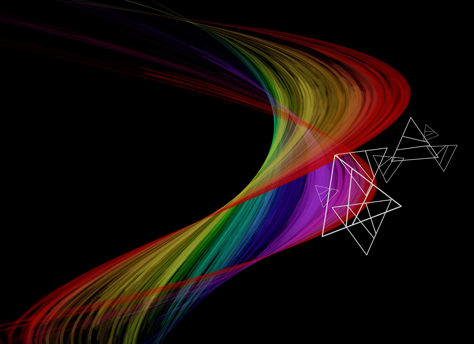
I quite liked the contrast with the black background so I used the war tool to see what it would be like. Working off the phrase 'bending light'.
As light is a spectrum of colours the colour theme is very wide so I have picked out the shape of the prism that separates the colour in light as a motif.
I quite liked the contrast with the black background so I used the war tool to see what it would be like. Working off the phrase 'bending light'.
As light is a spectrum of colours the colour theme is very wide so I have picked out the shape of the prism that separates the colour in light as a motif.
Thursday, 9 May 2013
Wednesday, 8 May 2013
Choosing Materials for my Garment Piece
Initially I started off with paper and split pins after seeing Una Burkes armour like pieces, and paper is easy to manipulate.
But after thinking about how I am to apply a print I think white paper would look good as a canvas for a projection or even to apply it with photoshop. This also made me experiment with acetate for it's light reflective properties. And I wanted to include done fabric manipulation after seeing the balloon stuffed suit. I also added tracing paper to the list of materials as it is between the two transparisies of paper and acetate.
Reflection:
As the acetate was hard to photograph I decided to put the fabric under it instead of on the surface and I also thought about the way I could have a light up fabrics with LEDs woven in or optic fibres attached to the acetate.
Small final sample of optic fibre like acetate. This could be improved by using colour onto it if I only needed a temporary substitute for optic fibres for my photographs.
Combining Light Theme for Print
With the samples I have already made I decided to try to put them together to see how they would work, however I don't think these samples were very successful as they printed out a bit too subtle.
Thursday, 11 April 2013
Tuesday, 9 April 2013
Tuesday, 19 February 2013
Developing My Designs
Beta Fashion Entry 1

I was not happy with the original design as not only the colours seemed to be derived from primary colours instead of the African parrot but also there was no clear boarders, however I did design this with a large repeat in mind for a bigger sarong or scarf but I think it would benefit from some sort of boarder and softening of the background.
Continuance of Animal Theme
As I was rush in completing a design for the Beta fashion competition I felt that I didn't include some of my favourite animals, after researching at my local museum for some animal ideas I manage to play with random in composition and layer filters. From two motifs I have rearranged the zebras and removed of the giraffe in this experimentation. However now I feel this design is more for a duvet cover or stationary design than a scarf design.
Tea Bag Splashes
Here I've tried to make it look mirrored but not too geometrical. I found the zebra print was too bold and stood out a bit much so I filtered the layer to an overlay and quite like the subtle hint it has now turned into.
Fish Layer Mask
Tuesday, 9 October 2012
Workshop 1 - Creating Patterns
Using spots and stripe patterns and creating repeats from parts of scanned in images. Here I haven't thought about the merging of stripes and my sketch much, so I think that is why it doesn't quite visually work. However the repetition of the sketch is consistent because of the plain black and white theme.
Sunday, 3 June 2012
Exhibition planning
1000 Post-it notes so far. Not convinced with just suspending the piece so I decided to see what it looked like interacting with the space a bit more.
I tried to make it look like it was growing/spilling out of the building itself but it didn't quite give the impression.
Thursday, 17 May 2012
Experiments with my work
I added the neon coloured previous samples to see what it would look like. It doesn't quite work with the faded yellow coloured Post it notes so I took them off again.
This is what it looks like after approximately 600 Post it notes:
I think it needs to be about twice the size to make more of an impact, like a huge sound wave is being produced from the surrounding space.
This is what it looks like after approximately 600 Post it notes:
I think it needs to be about twice the size to make more of an impact, like a huge sound wave is being produced from the surrounding space.
Tuesday, 15 May 2012
I tried to alter the colour of the Post it notes by adding black or subtracting the colour to make it white with bleach and ink. However I don't think this was too successful because it didn't really fade with the bleach and the black ink just took away from the shape.
So I plan to keep the original colour of the Post it note but use the colour and size of the original note.
Monday, 14 May 2012
Samples of work
I started to experiment with making the sound waves into a 3D object. I contemplated using CDs and Vinyl however they are not only quite expensive they are also had to shape by hand. After seeing Beth's work and experiments with folding/manipulating paper (and http://1052162315.blogspot.co.uk/2012/04/small-tiny-books.html) inspired by the previous students work seen in Special Collections I decided manipulating paper would be appropriate.
After looking in a few shops for stacks of budget paper I realised Post-it-notes had the beginnings of the right shape I wanted, of this 'stacked' theme.
I decided to fold the paper into triangles before sewing them loosely because it reminds me of the negative cut outs that I created, it is a subtle sound wave representative. Looking at the above picture I will experiment with quantity, as how it fills the space creates a different view on the original product.
I think making them twist and turn around each other creates added interest.
In the above picture I experimented with making it look more like a sound wave, which was a success however I questioned whether it would be an appropriate use of time if I was going to create it in large quantities.
Suspending it alone doesn't quite have the impact I want, on the other hand I like how it doesn't look like Post-it-notes at all from afar. But the colours distract from the shape so I will try to rectify this by using more of the same colours and try dip dyeing them to see what they look like.
Looking at other members of my group I noticed similar sound wave shapes in their research and work. For example Kerry stacked objects and some negative spaces created in this repeat of object pattern looks the same http://imagineit-group3.blogspot.co.uk/2012/05/stacking.html
After looking in a few shops for stacks of budget paper I realised Post-it-notes had the beginnings of the right shape I wanted, of this 'stacked' theme.
I decided to fold the paper into triangles before sewing them loosely because it reminds me of the negative cut outs that I created, it is a subtle sound wave representative. Looking at the above picture I will experiment with quantity, as how it fills the space creates a different view on the original product.
I think making them twist and turn around each other creates added interest.
In the above picture I experimented with making it look more like a sound wave, which was a success however I questioned whether it would be an appropriate use of time if I was going to create it in large quantities.
Suspending it alone doesn't quite have the impact I want, on the other hand I like how it doesn't look like Post-it-notes at all from afar. But the colours distract from the shape so I will try to rectify this by using more of the same colours and try dip dyeing them to see what they look like.
Looking at other members of my group I noticed similar sound wave shapes in their research and work. For example Kerry stacked objects and some negative spaces created in this repeat of object pattern looks the same http://imagineit-group3.blogspot.co.uk/2012/05/stacking.html
Subscribe to:
Posts (Atom)