Showing posts with label reflect. Show all posts

Thursday, 13 March 2014

How much am I worth? Pricing Research and lecture reflection

Thinking about freelancing and how much I would sell my prints for, I have to take into consideration if I am selling a product with the print on or the prints as a collection to be used by the client.

Looking at Nada Hercerg, the digital print artists that creates kaleidoscope prints similar to me. She possibly creates the prints and then sells them onto DiGuardo Boutique (http://diguardo.co.uk) which they then get them printed and then sold in their pop up shops and online store. Or she may have them already printed onto 100% silk all roughly around a square metre.


http://diguardo.co.uk/products-page/accessories/blooms-cashmere-scarf-spring-2014/

This website supplies accessories from a range of designers. Looking at scarves they sell them at a price range of £35 for a viscose scarf, up to £79 for a 100% cashmere one.

From the 'How much am I worth?' lecture and seminar, I have found that you have to consider ALL costs, some which can be easily overlooked. Consideration of price per hour of your time communicating ideas, making, researching and proofing your work in taking into account for a job.
Never undervalue yourself and work out how many hours you will realistically work in a year and decide on a salary. More will have to be included once you have a studio and place to live, as this will include overheads of bills and making a living in the price to not only cover the costs but you will also have to make a profit and have money for the days that you will have no work when you are only freelancing/rainy days.

Thursday, 12 December 2013

PE Presentation Review


Were your aims / objectives clearly articulated visually and verbally? I explained well what process I was using to create my designs but may have been undecided when it came to what I was going to do with them next. I was advised to continue with fabrics and link it more with the life and death idea, for example using ethereal like and transparent fabrics to print on. And also looking at what you can further do with the accessories idea, or example attaching accessories to garments to contain ashes, or creating labels of memoires to the garments.
 
Did you include appropriate contextual references? Included relevant images that had been specifically picked out so they related to what I was talking about in my presentation but maybe needed more, which would be gained from more artist’s research so I could put artists between each process of my work so it linked better, and then I could have added more pictures of my own work. I could have also worked on the layout of the images more as they were a bit square and was not consistent throughout the slides, I could improve this by creating the images in Photoshop so I had a collage of my drawings and then put them in a slide.
 
How well did you explain your theme, idea or concept? Needed more thorough explanation of the wearing death idea. But it's still not a focused concept so it’s still quite open, just has an underlying theme. More practise of the presentation could have been beneficial as it didn’t quite flow, but nerves did make me forget some points at the beginning of the presentation.
 
Are your methods, techniques / lines of enquiry clear and challenging enough? Working outside of my usual process of taking photos and making them straight into a print, by creating more conceptual work. This involved more research and analysis, but also finding a way of translating my ideas into a visual print. I think I articulated quite well how I wanted to create more depth and dimension to my digital prints by using a range of media when I am drawing and then working into them after I have printed them.
 
How or will the project I am working on now relate to the next unit (Unit X)? I would possibly continue the idea and create flats of the printed garments or accessories into one or more collections.
 
Are you clear about the market or context of your work? Missed out mentioning a specific season being autumn winter if I was using wools or spring summer if I was using light and transparent fabrics, and the buyer profile = young fashionistas that aren't afraid to experiment and challenge to boundaries of fashion.
 

Wednesday, 4 September 2013

Sunset in Ibiza


People have constantly bee captured by the beautiful colours of sunsets. Sharing my experience of the sunset in Ibiza on the rocks by the famous Cafe Mambo. 

Related text:

The meaning of sunset by Emilie (writer from Albania)

"What can you say about the deep meaning of sunset? How can you relate in to your life? Is it happy or sad moments ?
Sunset is the begining of night time ,I called it "the night's gate" . I think it's a sad time for some people.But for me it's the calm and warm time. I can have all my writings and work at this time. For all the things in life you can make anything as happy or sad moments of your life. I hope you enjoyed my writings.
Thanks for reading it.
By Emilie  "

Friday, 16 August 2013

Glen Ronald

http://instagram.com/glenronald#

Glen Ronald is a Canadian fine artist that creates his own interpretations of his inspirations as 11x14 Fine Art Print on Cold Press Watercolor Paper prints that he sells in his own online shop. www.etsy.com/uk/shop/GlenRonald?ref=l2-shopheader-name
You can see by his videos, his attention to detail and almost spontaneous application of line.

Thursday, 4 July 2013

Photoshop Logo


First edit

Experiments in Photoshop for https://www.facebook.com/pages/Pottymouth/262920257058769?fref=ts

Adapted from image:

It ended up looking more like a t-shirt design and being too complicated for a logo, however it was fun to create.

Tuesday, 18 June 2013

Reflective Review Of 2013 Degree Show


Ban Howamdeh


The display cabinate was like a jewellery shop and the intricate designs were very thoughtful. 

Verity Gale

All of the fashion garments were displayed elegantly in a room full of projections. 

Bella May Leonard 

The best display for experience was this arch as you could interact with the piece. However I felt the stitching seemed quite basic, but effective as it was such a large piece and there was a colour theme. 

Friday, 17 May 2013

Final Outcome


My trend book is aimed at the audience of print and pattern designers for possibly Spring/Summer 2014/2015 because it mainly consists of atmospherically pages, suggestions of motifs, and inspirational images.


Although I struggled a lot with dealing with a new way of thinking and working with the mostly conceptual research and creating 3D structures for this project, I think I benefited from exercising my skills in these areas because now I will know what to do and expect next time.

I felt that my time management was quite poor as once I got to creating the trend book that there wasn’t enough visual material for it, as I had been concentrating on creating the garment on the mannequin more. I also think I would have benefited from researching trend and look books more to inform the content of my book as I had previously never really seen one before. However from my research into the process of how and why designers get their inspiration for their next trends from trend books has enlightened me in the process of the design practice of digital print that I plan on going into in the future. I also found that having tutorials with a range of other practitioners can bring a refreshing insight to my work, as the presentation with Laura Bowker made me think about my work in a different perspective.

Overall, I think I have found a balance between research and visual material for the trend book if I was to do this project again. Because I think there’s a point where you research too far at the beginning of the project that you lose the original concept, so I think that is why I struggled with my concept. And I would have spent less time on the slow processeses of manipulating the fabric of my 3D construction, so I had that time to research into trend books more.


Tuesday, 14 May 2013

Further Development of my Light Theme Print

In keping with the reflective parts in the prints. I have included my safety pin samples into these ones for that quality that I want and then layered manipulated versions of my colour and sketch samples ontop.

Above: The developed  prinst sample from the two subtle prints that I did, I have increased the contrast and applied one of my wax and ink drawing on top. The wax and ink sample was inspired by the circuit boards in technology.


Above: This print is focusing on 'electrical spark' like spots of colour that I picked out of my dispersed ink samples and layered them to create a repeatable all over print.

Developing my Light Print


I began free transforming each motif one by one but I wanted it to follow a more controlled path.

So I created a scatter brush in Illustrator to get this effect. I also tried to see what it would be like with a graph paper like background, but I think this will make it look too mathematical.

 I will try projecting these two prints to see which is more effective or whether it even shows up or not.

The shapes idea was also slight inpired by Geometry Wars game:


I also took on board the feedback that I got from design competitions such as threadless, and kept it quite simple.

Reflection: This ended up being an element of my trend book, will still be projected onto my garment.

Empasizing my Theme of Light in Print

For this I have used the scans of the safety pin samples to inform the shape and the colours in light for the colour and placement.


I quite liked the contrast with the black background so I used the war tool to see what it would be like. Working off the phrase 'bending light'.

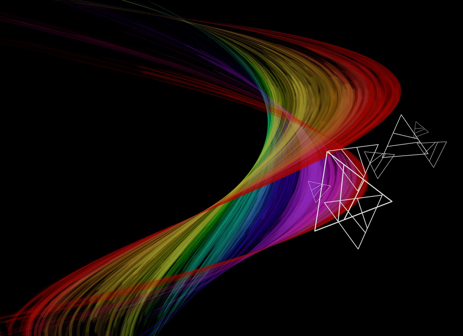
As light is a spectrum of colours the colour theme is very wide so I have picked out the shape of the prism that separates the colour in light as a motif.