Showing posts with label Evaluation. Show all posts

Thursday, 12 December 2013

PE Presentation Review


Were your aims / objectives clearly articulated visually and verbally? I explained well what process I was using to create my designs but may have been undecided when it came to what I was going to do with them next. I was advised to continue with fabrics and link it more with the life and death idea, for example using ethereal like and transparent fabrics to print on. And also looking at what you can further do with the accessories idea, or example attaching accessories to garments to contain ashes, or creating labels of memoires to the garments.
 
Did you include appropriate contextual references? Included relevant images that had been specifically picked out so they related to what I was talking about in my presentation but maybe needed more, which would be gained from more artist’s research so I could put artists between each process of my work so it linked better, and then I could have added more pictures of my own work. I could have also worked on the layout of the images more as they were a bit square and was not consistent throughout the slides, I could improve this by creating the images in Photoshop so I had a collage of my drawings and then put them in a slide.
 
How well did you explain your theme, idea or concept? Needed more thorough explanation of the wearing death idea. But it's still not a focused concept so it’s still quite open, just has an underlying theme. More practise of the presentation could have been beneficial as it didn’t quite flow, but nerves did make me forget some points at the beginning of the presentation.
 
Are your methods, techniques / lines of enquiry clear and challenging enough? Working outside of my usual process of taking photos and making them straight into a print, by creating more conceptual work. This involved more research and analysis, but also finding a way of translating my ideas into a visual print. I think I articulated quite well how I wanted to create more depth and dimension to my digital prints by using a range of media when I am drawing and then working into them after I have printed them.
 
How or will the project I am working on now relate to the next unit (Unit X)? I would possibly continue the idea and create flats of the printed garments or accessories into one or more collections.
 
Are you clear about the market or context of your work? Missed out mentioning a specific season being autumn winter if I was using wools or spring summer if I was using light and transparent fabrics, and the buyer profile = young fashionistas that aren't afraid to experiment and challenge to boundaries of fashion.
 

Sunday, 3 June 2012

Exhibition


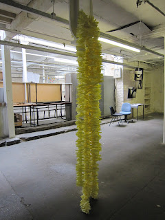
I finally decided on draping it over a pole as the shape reminds me of a speaker, so the piece looks like it is travelling out and spilling out into the area. Clearly reflecting my original idea of having sound waves filling the space and allowing the viewer to see the unseen.

Thursday, 19 January 2012

Sampling Project

Blog evaluation for Sampling Project

Wild card task

Initially I set out on this project thinking about just one pair of words 'monochrome' and 'colour' as I wanted to try using these two closely related but opposites and somehow make it work. I think I archived this as I developed my dye skills and experimented a lot with creating black in the dye lab which was interesting, because even though the samples may not have been completely black and varied in shades of grey and blue. It expressed my intentions clearly, as I wasn't trying to archive black, but the dark colours that appear black.

Various ways of resist dying with Indigo dye (Chevore, tie, compression)

Although I didn't get to join the machine embroidery workshop for this project I was flexible and changed my ideas only slightly, because I kept my original starting point of buildings and surroundings but developed it with the words I chose. My original start was going to be free machining the sketches and visual research that I collected and then further developed them, however I think through taking up intermediate dye I was able to fully explore the effects of different dyes on different types of fabrics more thoroughly. This is a useful skill and an experience that can be effectively applied to any future dyeing processes that I may come across.

Various shades of black using similar dye methods

I found it useful to look back at old samples and create links that may have not been obvious at first, because then I was able to see any ideas that would potentially be a specific topic, or skill that I like to continuously use. I would take this into account for my future projects as it is helpful if I'm ever struggling. Another task that I found refreshing was the Wild Card task, where we were challenged  to incorporate possibly irrelevant images into our projects. Whilst I was completing that task it made me think about the second pair of words that I chose 'collapse' and 'build', because I felt that I was being too precious with my samples as I wasn't able to de construct them and reconstruct them to pursue these words. Eventually I changed that to 'regular' and 'irregular' after examining the quality and shapes in my tie dye samples. However I don't think I was able to fully explore the words as much as I wanted with sketchbook work as I chose these new words quite late on into the project.

One of the photographs that I took in the Wild Card task to show the partnership of irregular shapes I archived with starch resist dying and old gum stuck to the floor

It is almost second nature to me to have ongoing visual research to keep me inspired and give me ideas for my next sample. I also researched some dye techniques before I started my dye workshop, so I could get an idea of what I could do in the time I had in the dye lab. I found that valuable as it opened up thoughts of batik, the history of dye, and dye techniques. So I wasn't just limited to dying a piece of cloth a block of colour or for the sake of it. Even though we didn't use batik with hot dyes, the great alternate of starch resist dying in the Indigo vat created some interesting shapes that took on a large role in this project.

Creating colour charts was a new experience for me and I've never been very good with mixing exact colours, so this was good practice for me and I will continue to exercise this skill.

I find that if something is working well for someone in my group people tend to pick up on it, but only if it was something that could be generally applied to with their own work. However as people naturally interpret things in their own way, most of the time they have alternate results so our work is never the same. I think it is useful to be able to see other peoples work because it could influence any ones project and see ideas from an alternate view.

One of my peers influenced me to use the colours of blue and red in the style of 3D pictures for my blind contour sketches.