Showing posts with label review. Show all posts

Monday, 10 March 2014

WGSN Research

Spring/Summer '15 Design Inspiration
 
By the WGSN Accessories Team, 20 August 2013
Formal silhouettes are punctuated by kinetic colour while classic shapes are subtly engineered to embody a modern femininity, inspired by WGSN's Focus Macro Trend.
Clutch and handheld bags are carefully tailored and neatly compact while embellishments take a back seat as gradient surface colour is made a feature of. A soft, sculpted volume is embraced in contrast to more ridged structures within the collection. Colour is screened, distorted and developed within the pieces.
 

Gradient bangle by Maiko Gubler
Maiko Gubler

Maiko Gubler uses 3D printing technology to create his wearable gradient bangles. Colour blends seamlessly throughout each form.

www.maikogubler.com


Works on reflection II by Kim Thome
Kim Thome

Kim Thome's installation at the William Benington Gallery in London sees stripes of colour reflected and refracted through panes of semi-opaque glass.

www.kimthome.com
 
Neon Accents
 
 
Gargiulo at Lineapelle S/S 14
 
SS15 Focus womens Casual wear

 
Gregory Parkinson pre-summer 2014
Gregory Parkinson, 2014, Pre-summer, New York
 
By WGSN Content team, 15 August 2013
Casualwear has a carefree romance with a youthful and playful look. Relaxed shapes bring a fresh urban attitude with a hint of homely nostalgia, in line with WGSN's Focus Macro Trend featured in the spring/summer 2015 Fashion Forecast.
Faded cottons and denims are worn back with washed jerseys, while waisted lightweight cotton dresses add to the romance of the poetic mood. Utility detailing and outdoor garments bring a fresh, young feel to the classic British country look. Subtly altered floral prints are used as graphics on tee-shirts, sweatshirts and denims.


Thursday, 12 December 2013

PE Presentation Review


Were your aims / objectives clearly articulated visually and verbally? I explained well what process I was using to create my designs but may have been undecided when it came to what I was going to do with them next. I was advised to continue with fabrics and link it more with the life and death idea, for example using ethereal like and transparent fabrics to print on. And also looking at what you can further do with the accessories idea, or example attaching accessories to garments to contain ashes, or creating labels of memoires to the garments.
 
Did you include appropriate contextual references? Included relevant images that had been specifically picked out so they related to what I was talking about in my presentation but maybe needed more, which would be gained from more artist’s research so I could put artists between each process of my work so it linked better, and then I could have added more pictures of my own work. I could have also worked on the layout of the images more as they were a bit square and was not consistent throughout the slides, I could improve this by creating the images in Photoshop so I had a collage of my drawings and then put them in a slide.
 
How well did you explain your theme, idea or concept? Needed more thorough explanation of the wearing death idea. But it's still not a focused concept so it’s still quite open, just has an underlying theme. More practise of the presentation could have been beneficial as it didn’t quite flow, but nerves did make me forget some points at the beginning of the presentation.
 
Are your methods, techniques / lines of enquiry clear and challenging enough? Working outside of my usual process of taking photos and making them straight into a print, by creating more conceptual work. This involved more research and analysis, but also finding a way of translating my ideas into a visual print. I think I articulated quite well how I wanted to create more depth and dimension to my digital prints by using a range of media when I am drawing and then working into them after I have printed them.
 
How or will the project I am working on now relate to the next unit (Unit X)? I would possibly continue the idea and create flats of the printed garments or accessories into one or more collections.
 
Are you clear about the market or context of your work? Missed out mentioning a specific season being autumn winter if I was using wools or spring summer if I was using light and transparent fabrics, and the buyer profile = young fashionistas that aren't afraid to experiment and challenge to boundaries of fashion.
 

Wednesday, 24 July 2013

SWAROVSKI ELEMENTS light up Artitude’s new chandelier

http://blog.swarovski-elements.com/en/swarovski-elements-light-up-artitudes-new-chandelier/#.Ue_SpKzhe1F
Inspired by the patterns that occur when sunlight falls onto fruit-bearing vines, the shadows and colours created by the crystals symbolize life in all its vitality. 

Leading Taiwanese lighting company, Artitude, has incorporated SWAROVSKI ELEMENTS in its latest beautiful chandelier. Entitled Seeking the Light, it’s an intricate blend of East-meets-West aesthetics that combines sensuous waves of bent bamboo with gracefully suspended crystal pendants whose movements refract the ambient light. Inspired by the patterns that occur when sunlight falls onto fruit-bearing vines, the shadows and colors created by the crystals symbolize life in all its vitality. Light, yet strong and durable, the bamboo structure gives Seeking the Light a contemporary edge, while the crystals lend it timeless elegance.

Tuesday, 18 June 2013

Reflective Review Of 2013 Degree Show


Ban Howamdeh


The display cabinate was like a jewellery shop and the intricate designs were very thoughtful. 

Verity Gale

All of the fashion garments were displayed elegantly in a room full of projections. 

Bella May Leonard 

The best display for experience was this arch as you could interact with the piece. However I felt the stitching seemed quite basic, but effective as it was such a large piece and there was a colour theme. 

Friday, 17 May 2013

Final Outcome


My trend book is aimed at the audience of print and pattern designers for possibly Spring/Summer 2014/2015 because it mainly consists of atmospherically pages, suggestions of motifs, and inspirational images.


Although I struggled a lot with dealing with a new way of thinking and working with the mostly conceptual research and creating 3D structures for this project, I think I benefited from exercising my skills in these areas because now I will know what to do and expect next time.

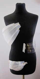
I felt that my time management was quite poor as once I got to creating the trend book that there wasn’t enough visual material for it, as I had been concentrating on creating the garment on the mannequin more. I also think I would have benefited from researching trend and look books more to inform the content of my book as I had previously never really seen one before. However from my research into the process of how and why designers get their inspiration for their next trends from trend books has enlightened me in the process of the design practice of digital print that I plan on going into in the future. I also found that having tutorials with a range of other practitioners can bring a refreshing insight to my work, as the presentation with Laura Bowker made me think about my work in a different perspective.

Overall, I think I have found a balance between research and visual material for the trend book if I was to do this project again. Because I think there’s a point where you research too far at the beginning of the project that you lose the original concept, so I think that is why I struggled with my concept. And I would have spent less time on the slow processeses of manipulating the fabric of my 3D construction, so I had that time to research into trend books more.


Tuesday, 14 May 2013

Empasizing my Theme of Light in Print

For this I have used the scans of the safety pin samples to inform the shape and the colours in light for the colour and placement.


I quite liked the contrast with the black background so I used the war tool to see what it would be like. Working off the phrase 'bending light'.

As light is a spectrum of colours the colour theme is very wide so I have picked out the shape of the prism that separates the colour in light as a motif.

Wednesday, 8 May 2013

Combining Light Theme for Print

With the samples I have already made I decided to try to put them together to see how they would work, however I don't think these samples were very successful as they printed out a bit too subtle.


Sunday, 28 April 2013

Further Developing My Ideas Spider Diagram


I decided on furthering my idea of 'Contouring/Changing the Body Shape' to combine with my 'Light' theme, and I found the prosthetics theme to be quite interesting as it hasn't really been done before in fashion.


Manipulating the Surface

Taking inspiration from Gareth Pugh's approach to distorting the body I've used safety pins to manipulate the surface of calico.